crider
Brand strategy & narrative, identity & icon, colour & type, packaging (D2C pouch), website hero/landing, OOH/posters, social templates, basic style guide

Challange
Lower the “disgust barrier” by making insect protein feel clean, credible, and tasty. Speak to early adopters without coming across as niche. Keep messaging non-medical while foregrounding sustainability and ease. The target users skew young (18–35) and open-minded, but need a friendlier presentation than typical entomophagy imagery.
approach
Product focus: Start with cricket (Orthoptera) for its availability in the UK and high protein yield; format range led by powder/flour/roasted/snacks.
Brand stance: “Preferable, not just possible” — unify preferences and normalise insects through tone, texture and everyday use.
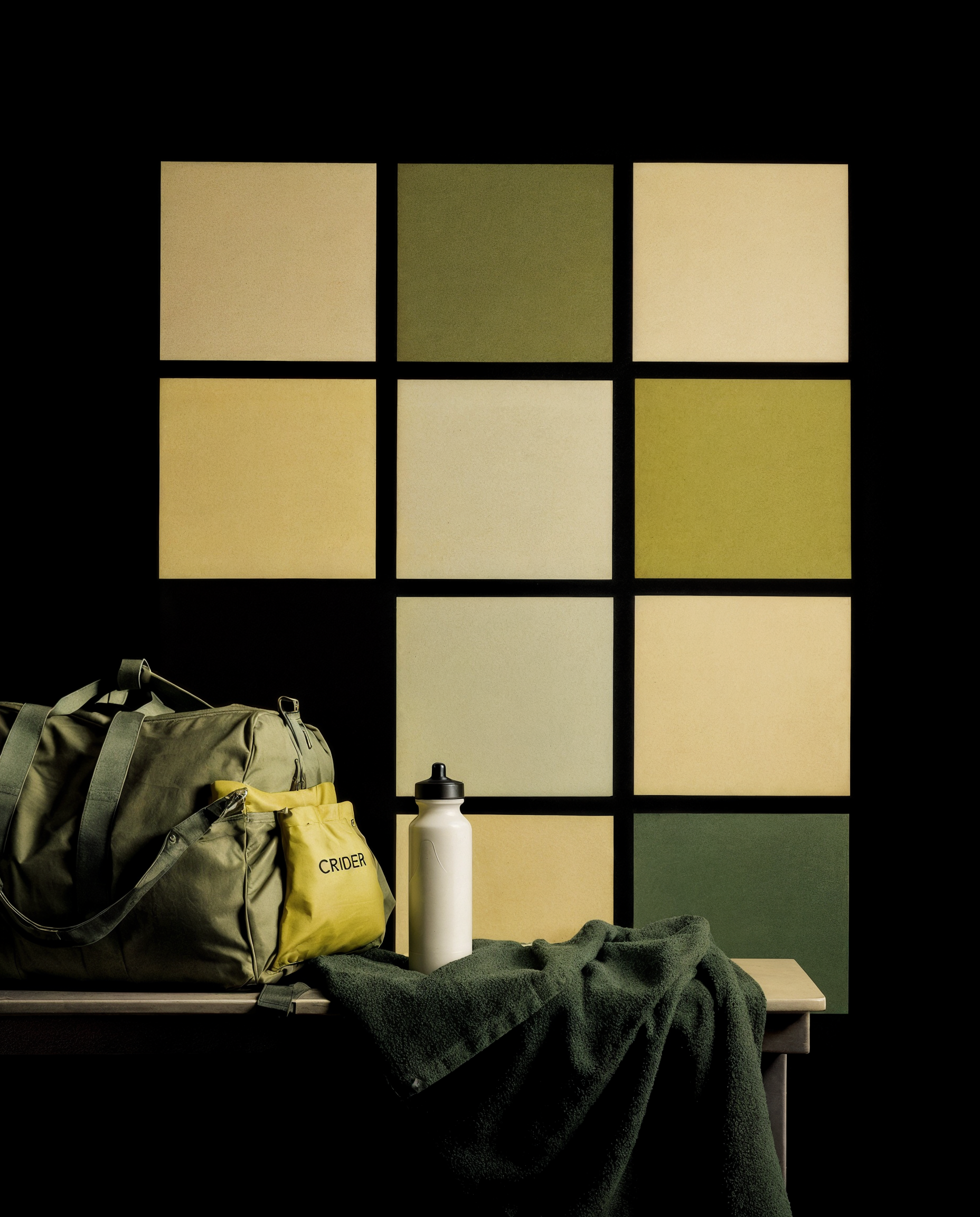
Visual language: Sage→deep green palette, soft gradients, rounded iconography; avoid insect macro close-ups.
Name & mark: CRIDER wordmark with a stacked capsule icon (abstracted cricket/body segments) used as a quality seal.
A modern, approachable cricket-protein brand that turns curiosity into an everyday habit.
Key Applications
Packaging: Matte sage pouch; reassurance badges; minimal claims; hero product visual.
Website Hero: Large headline, simple gradient, pack render and primary Shop now CTA.
OOH / Posters: Bold “Easter sale / 20% off” style frames with big pack visual.
Social Templates: Recipe tiles, “how to use” shorts, calm typography on green fields.
Style Guide: Colour swatches (sage→evergreen), icon grid, logo clear-space, do/don’t for photography.