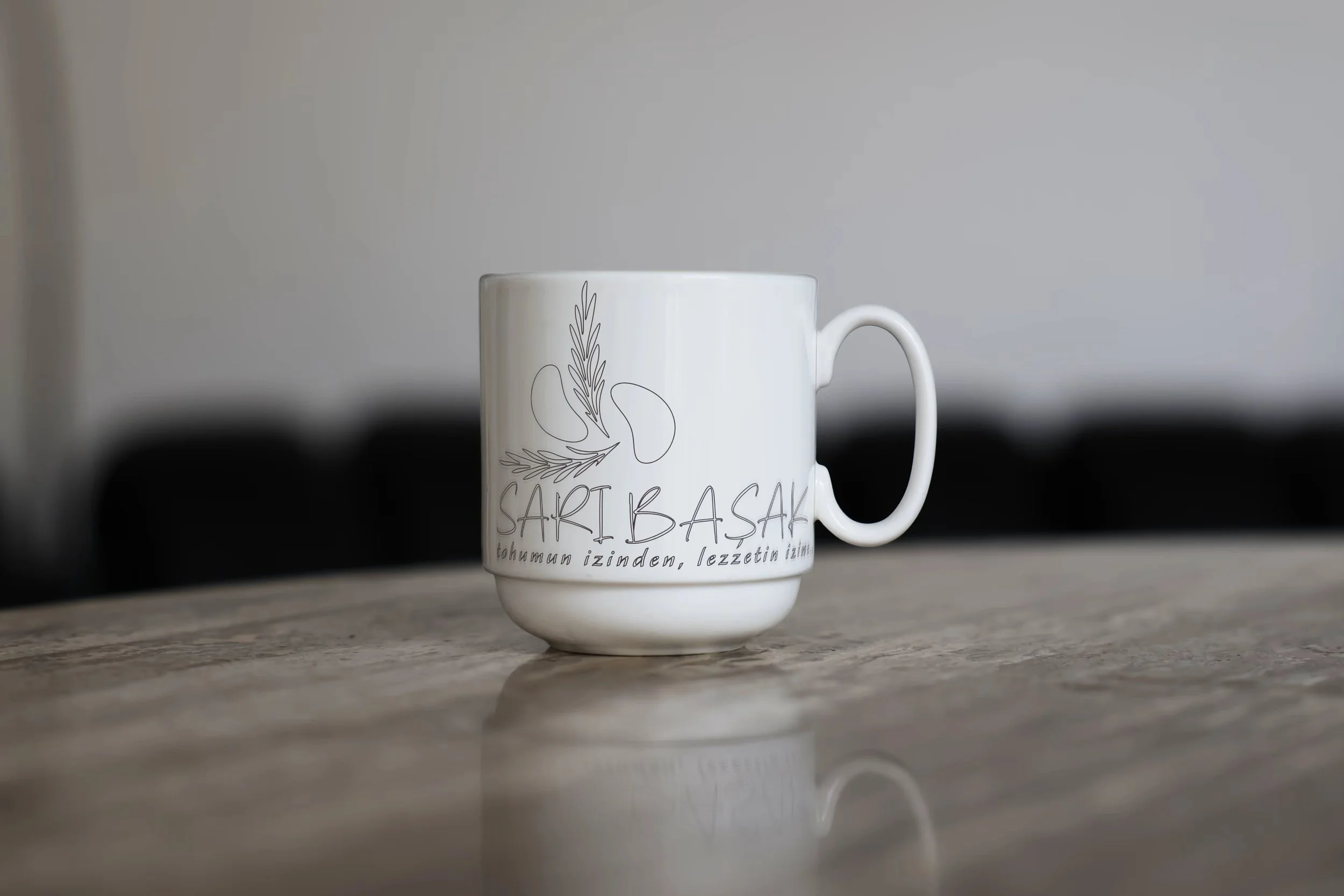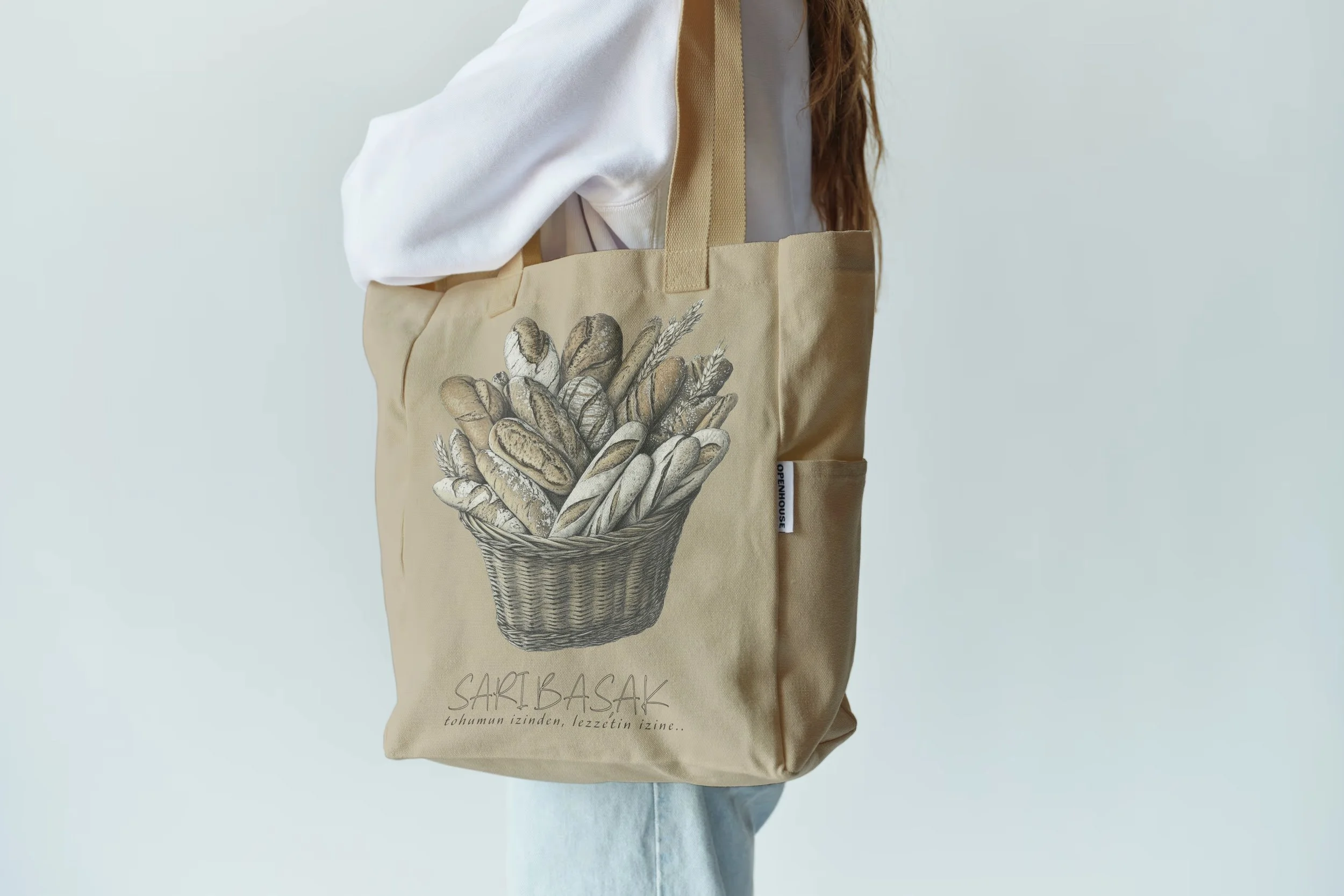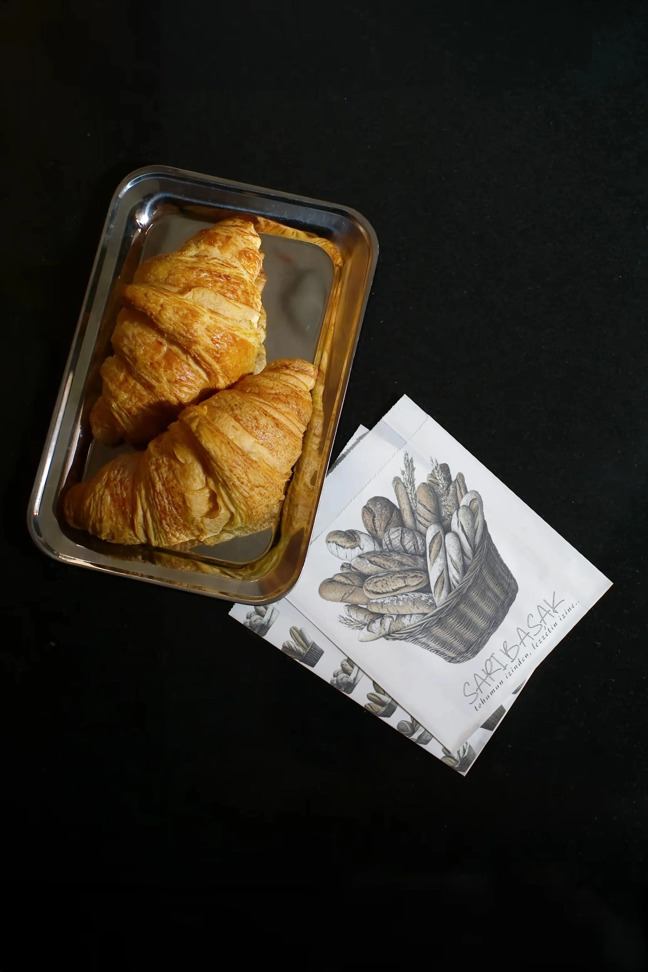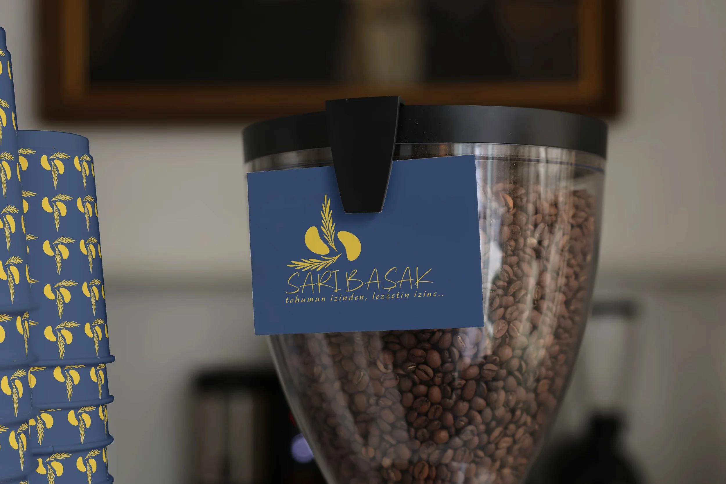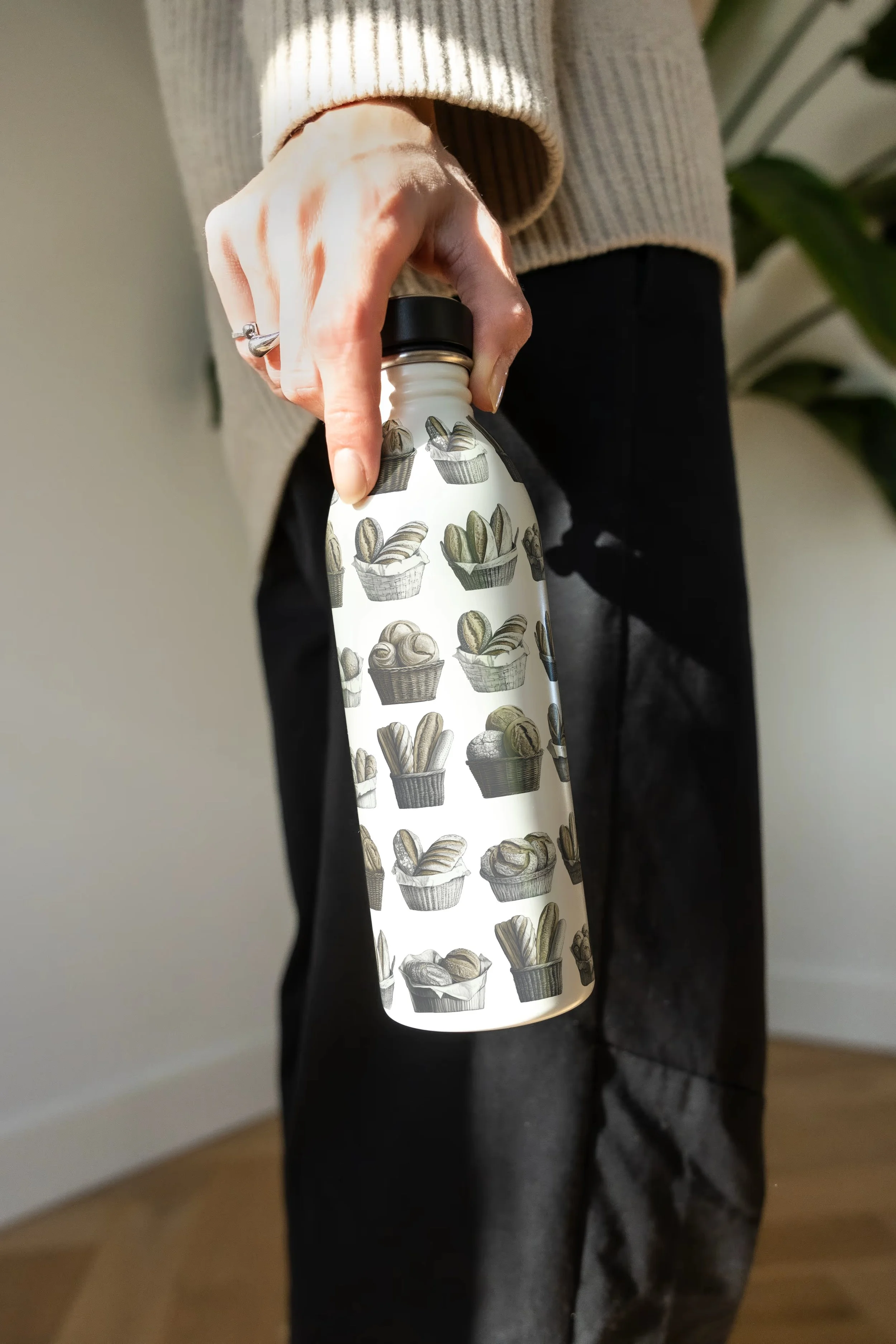
Sari basak bakery
Brand strategy, identity system, packaging, interior concept, loyalty, art direction

Challange
Make a heritage story feel premium and scalable (flagship → takeaway) without losing authenticity.
approach
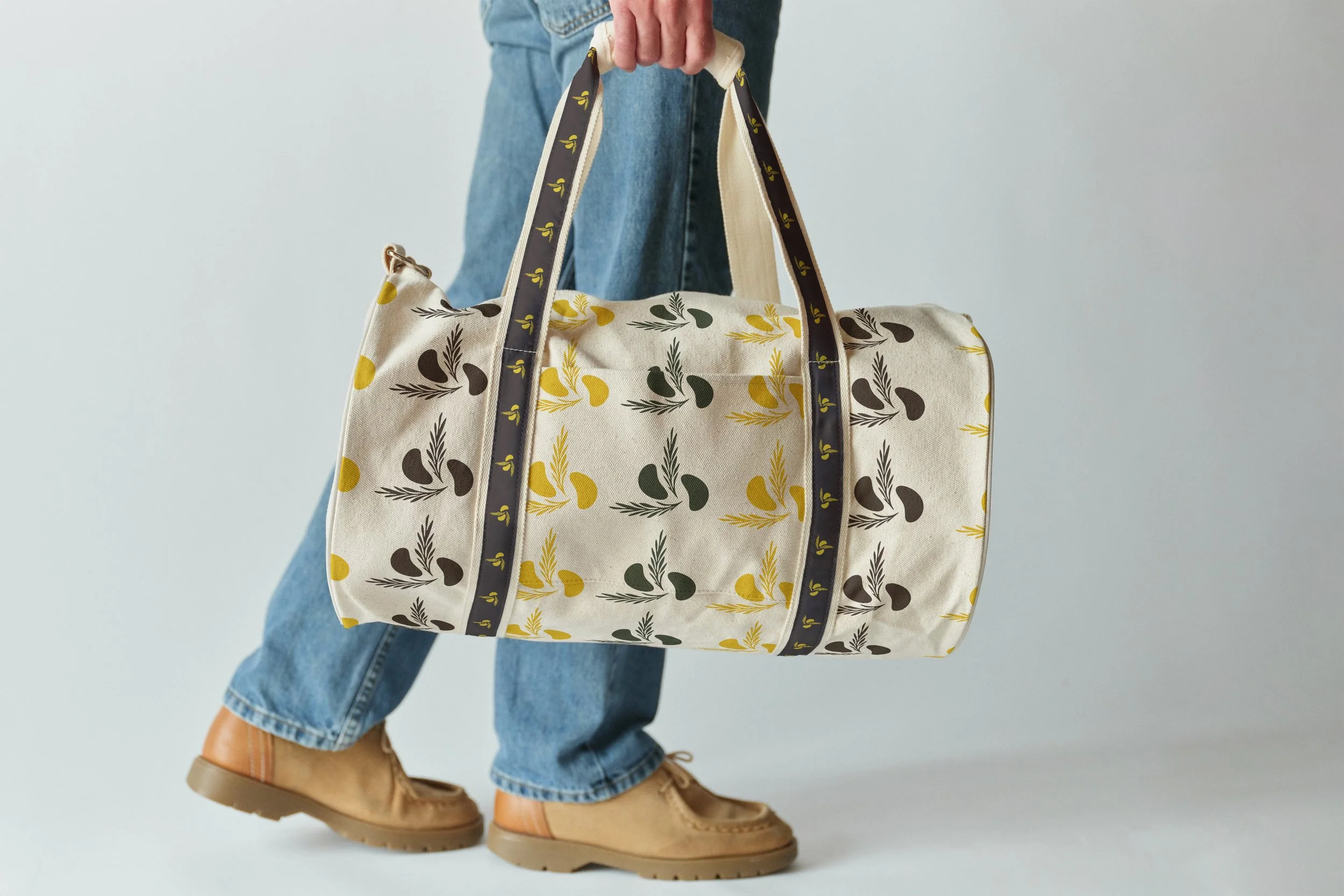
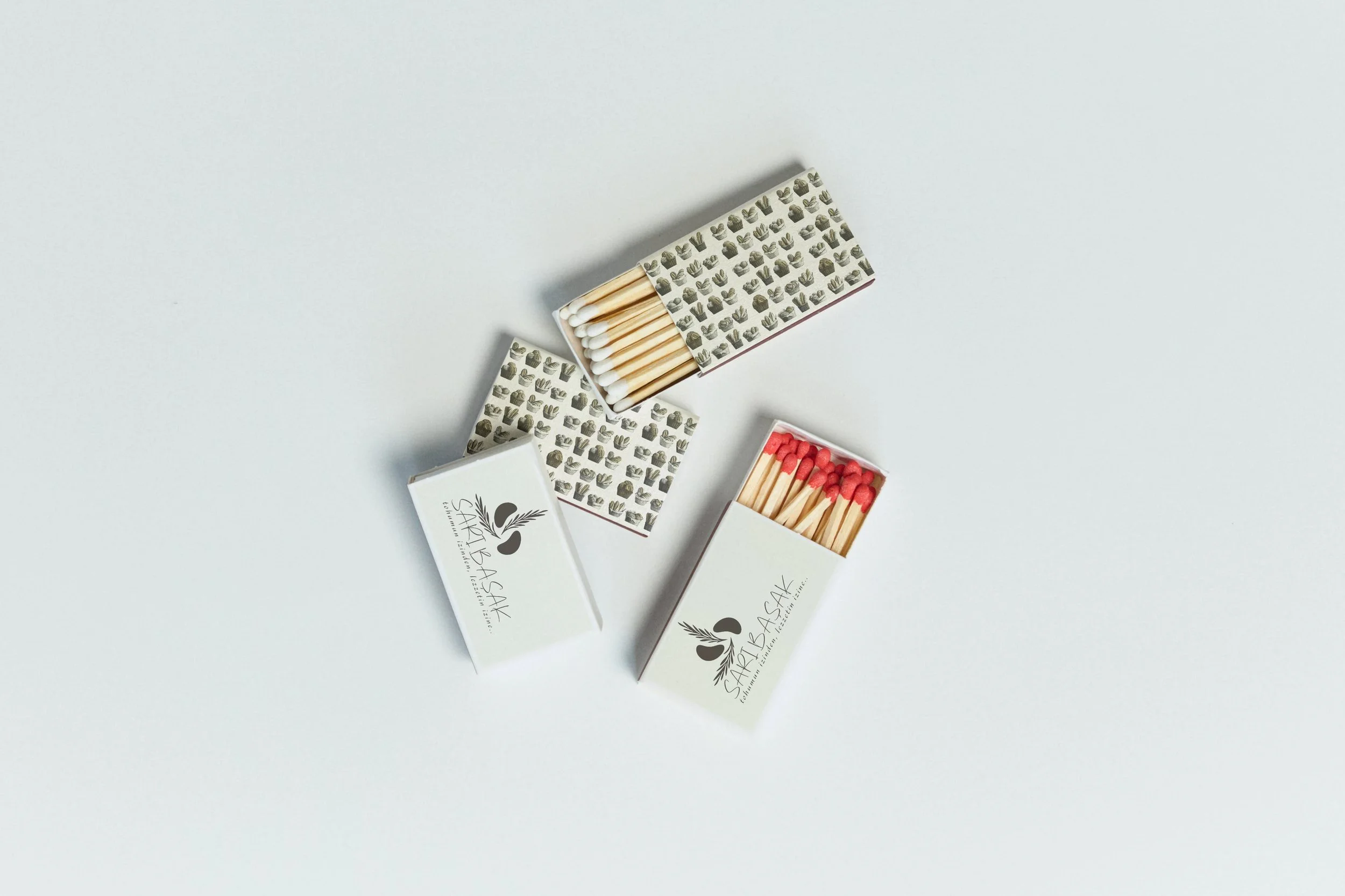
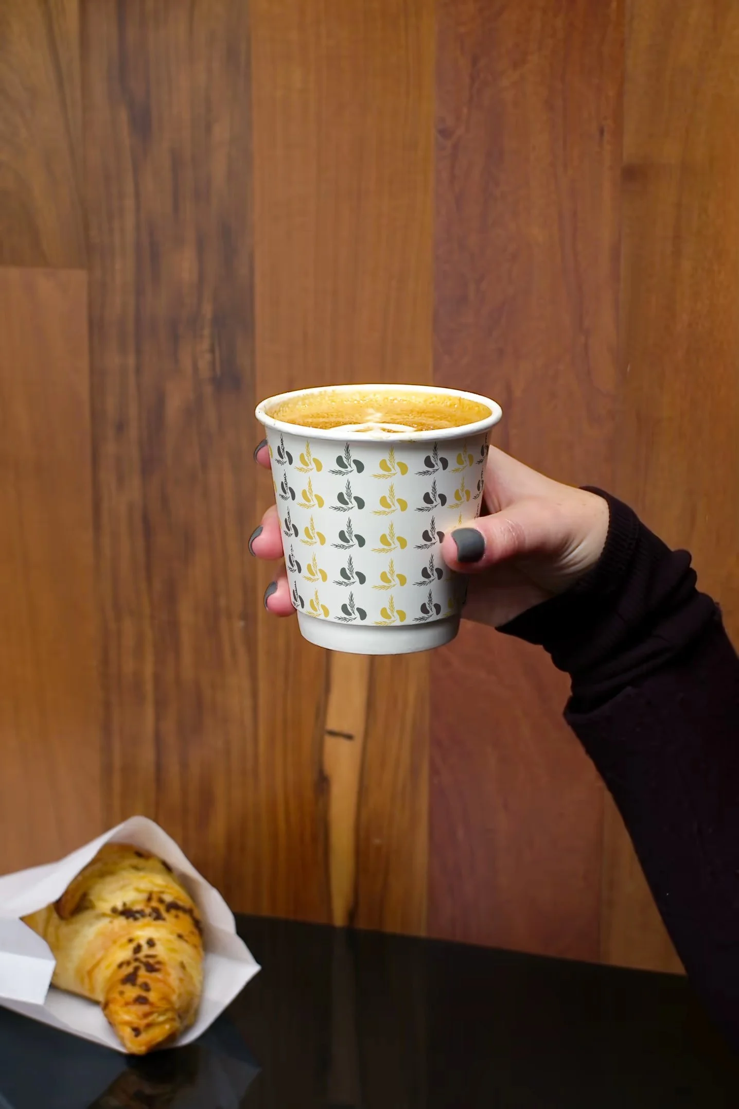
Anchor the brand in Elazığ’s Sarı Başak roots; S+B monogram hidden in a bread form; wheat-led palette; modern-rustic retail language.
A village-born bakery brand marrying Turkish tradition with modern minimalism.
from seed to savour.
Key Applications
Packaging: Kraft + wheat linework, navy micro-accents.
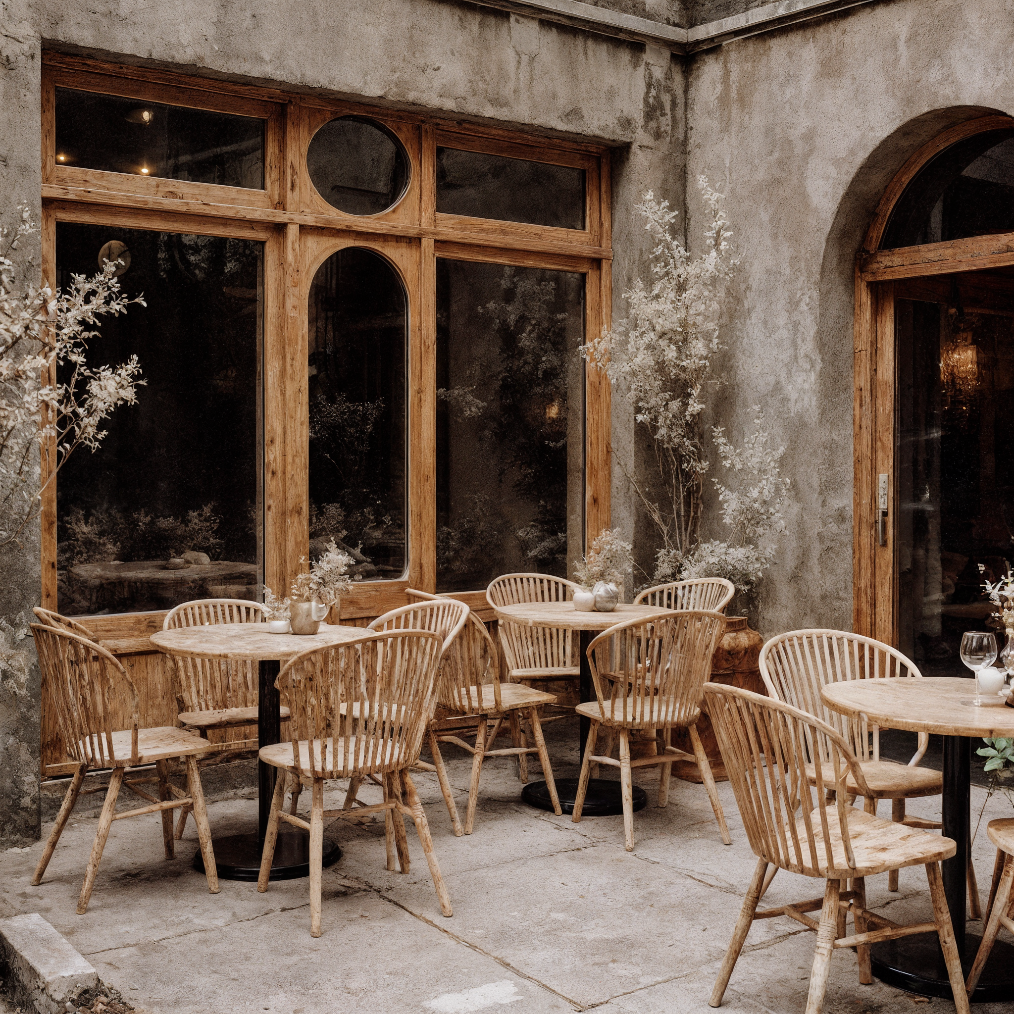
Interior: Stone-plaster walls, oak & rattan, navy metal details.
Staffwear: Lino/canvas aprons with wheat embroidery.
Loyalty card: Gold-wheat motif, “8→1” stamp flow.