valish chocolate
Brand strategy, identity system (monogram + wordmark), colour & type, pattern, packaging (keepsake tins + tissue), illustration art direction, website hero & promo, OOH/retail signage, social templates, brand style guideline.

Challange
Communicate sustainably sourced, high-quality cocoa and vanilla with a modern, collectable voice; increase seasonal creativity without diluting the core identity; build a system that’s consistent from web to OOH.
approach
A midnight navy core with moonlight blues as highlights; a sharp VA monogram accented by ribbon bands; a modular frame for seasonal illustrations (Festive, Cosmos, Night, Windows); a calm grotesque + italic type pairing.
A premium craft-chocolate identity where a midnight palette and ribboned VA monogram turn gifting into a small ritual.
Key Applications
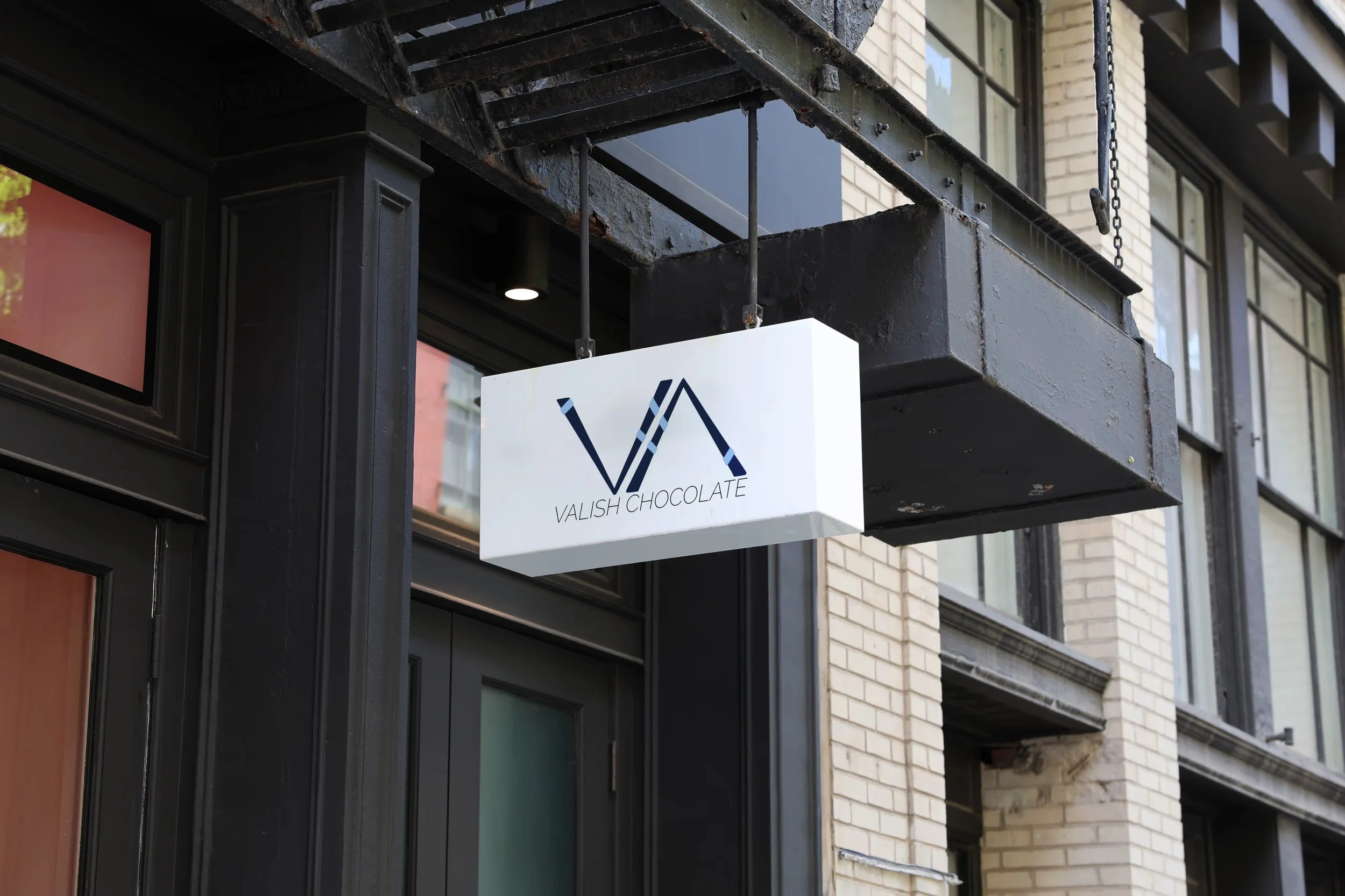
Logo/Monogram: Angular VA with ribbon bands; italic wordmark lock-ups.
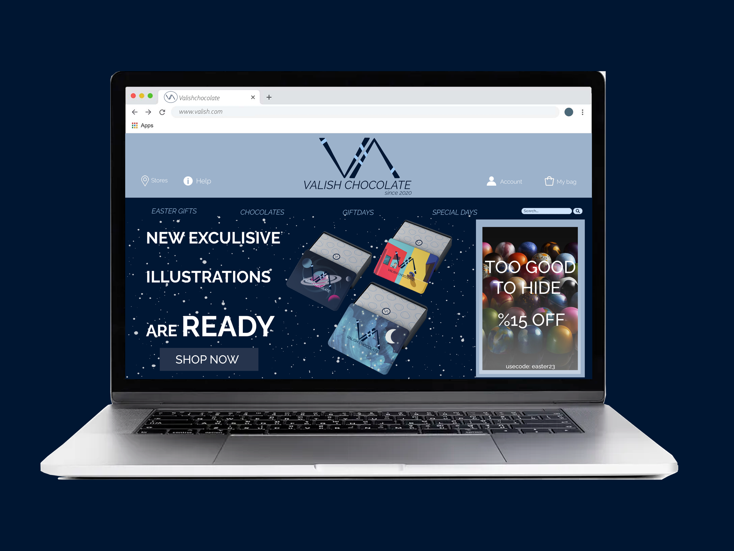
Colour & Type: Midnight + pale blue; clean grotesque with italic emphasis.
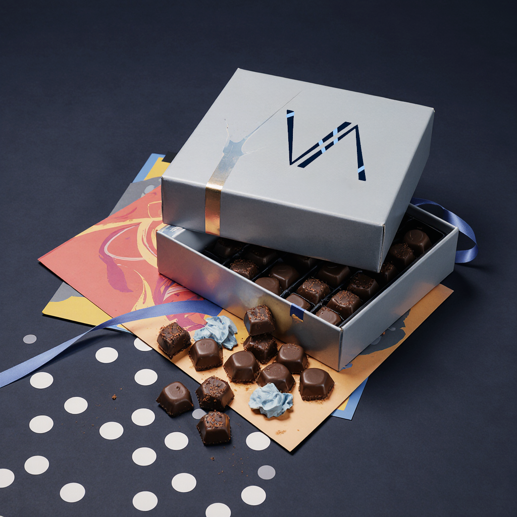
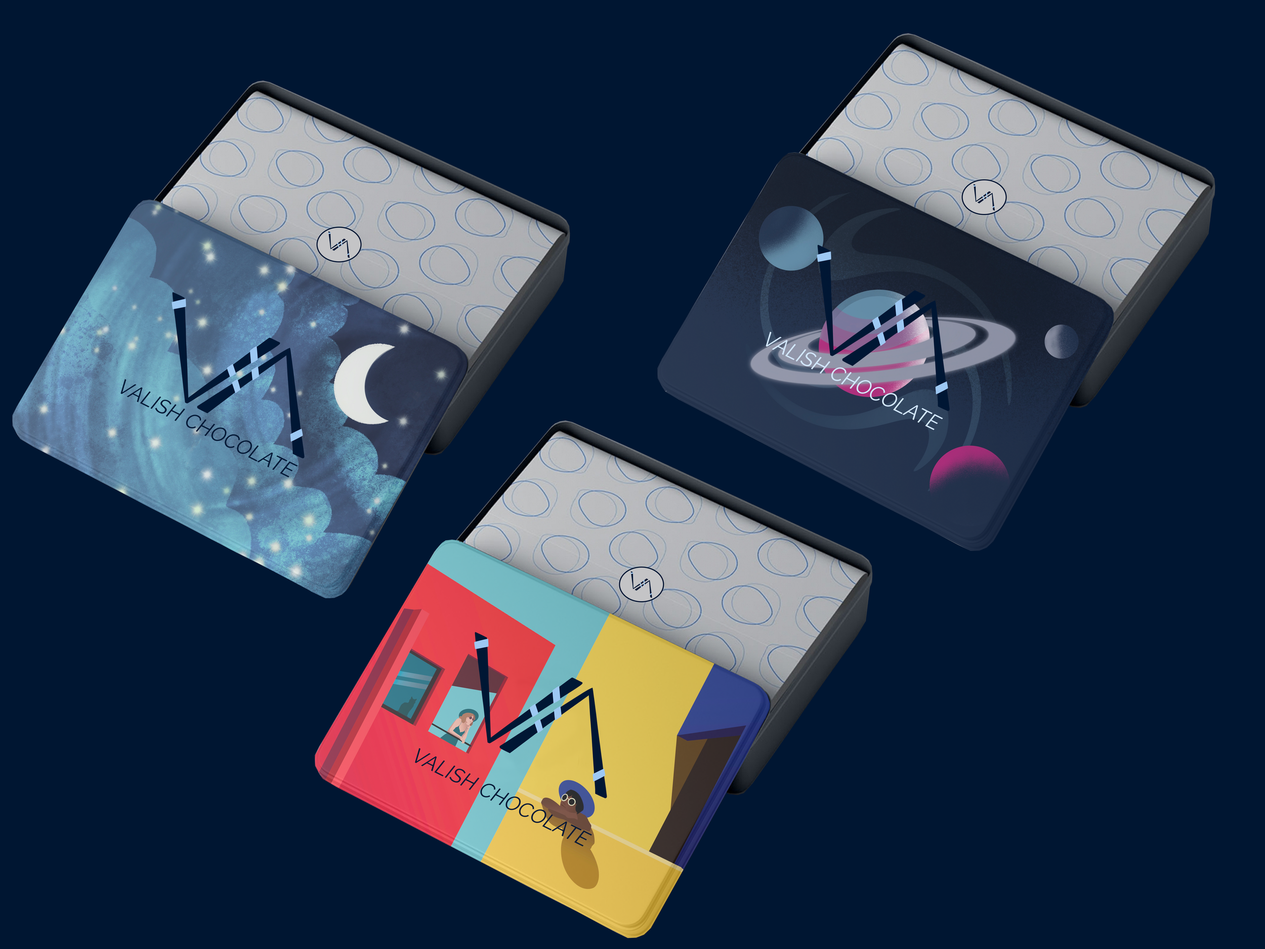
Packaging: Keepsake tins & “O” tissue; seasonal sleeves.
Seasonal Editions: Festive Tree, Cosmos, Night, Windows series.
Website Hero: Star-field product grid with campaign banner.
OOH / Posters: “Too Good to Hide” approach; minimal copy.
Retail Signage: Exterior lightbox and in-store POS.
Style Guide: Clear space, colour/type specs, pattern & application rules.